ONLINE DIARY

Email - paul@oddcoltd.com

Tel - (0191) 487 9212

Alternative collectable figurines and gifts...

Monday 30 April 2012

KAPOW! PRINT PART IV

"I decided, because the thin layers of acrylic (glazes) are drying patchy, to continue from this point in oil paints. It's OK to paint in oils over acrylic, but not the other way round. The moonlight through the windows was the first oily bit."


"Working with 'moon' colour and the creepy blue downstairs glow. Using oils means it can take a while for the paint to dry. This can be frustrating when you need to work over the top of something you've already done. Hopefully the painting will be dry in time for the comic gig. Gulp!"


Thursday 26 April 2012

KAPOW! PRINT PART III


"Once the shadows are in place, I started working on the forms as if there's a single light source, above and behind the viewer. Here I've worked on the overalls and the mask."

"Adding colour to the fur and the stairs, not wanting to have too much contrast in the stairs because they could dominate the image."
"Dropped some basic shading into the bannister and railings knowing that the secondary and tertiary lights will be acting on them quite heavily, so just establishing the structure for now."
"I decided the rag doll should have socks. They somehow suggest innocence. I still need to add the seams to the legs. We wouldn't want any sensitive types thinking this is a human or anything."
"If you check against the early visual, you'll see how the image is going to be cropped on all sides. At the bottom it will be part way through the green dress, so that blue area at the bottom right won't appear."

Wednesday 25 April 2012

KAPOW! PRINT PART II


"First step is putting in the dark bits. This is just sploshing down layers of dilute acrylic to create the places where there's least light, or a dark base to start building the form."


"There are three light sources I need to consider, a general colourless ambient light that will allow me to give some colour to the shapes, a cold blue light in the bottom left, then the moonlight through the window top right. There's usually a point in most paintings I do where I ask myself "What the bloody hell have I done and why does it look so shite?" That moment is fairly soon."

Tuesday 24 April 2012

LIMITED EDITION KAPOW PRINT!

Hey Folks! For those who didn't know, Bad Taste Bears will be attending the Kapow! Comic Con in London this May 19th/20th! For more news on the event and all happenings follow this link.

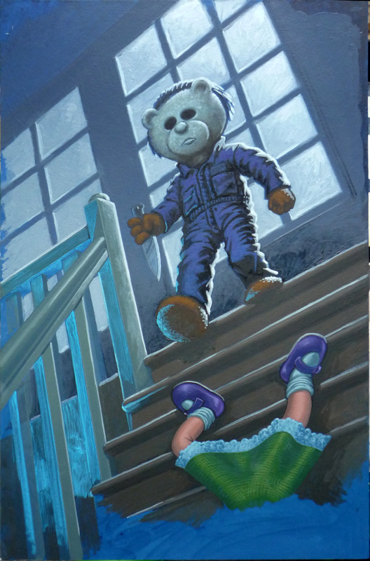
In preparation for the event, Bad Taste Bears creator Peter Underhill has been working on a Limited Edition Myers Print which is now available to pre-order here.

Great news for all fans of Pete's artwork, as he has invited us in to his Shedio (half studio/half shed,) to give us a preview of the work in progress and to watch the master at work. Thanks Pete!

So here's part 1. Enjoy.


"After establishing the composition with small thumbnail sketches, I dumped the sketch through Photoshop and played around with colour values, lights and darks to arrive at the rough you've seen." 


"Next stage is to draw up the image to a size comfortable to work. In this case, approx A4."


"I've already prepared a board with an overall blue onto which I transfer the drawing.
The next part is getting the paints out. More soon."


Part II to follow soon...